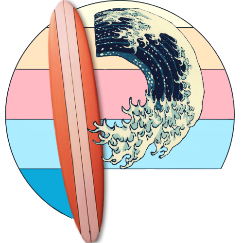
Pixelwaves is approaching the 2-year mark. There is a lot that has happened in those two years. I have acquired another college degree, learned more about myself, mastered the ability to reject those who are “emotional vampires” and traveled to new places. To celebrate this landmark, I have been thinking about a design makeover for the site and an original logo idea.
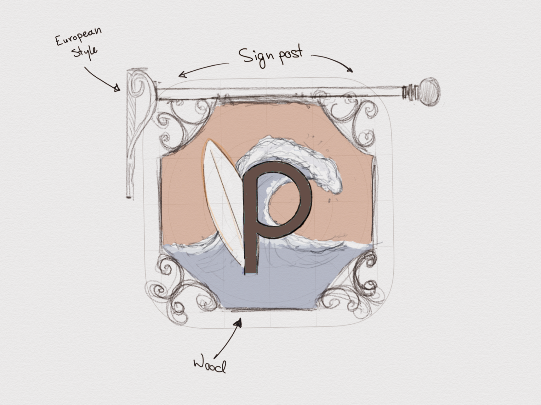
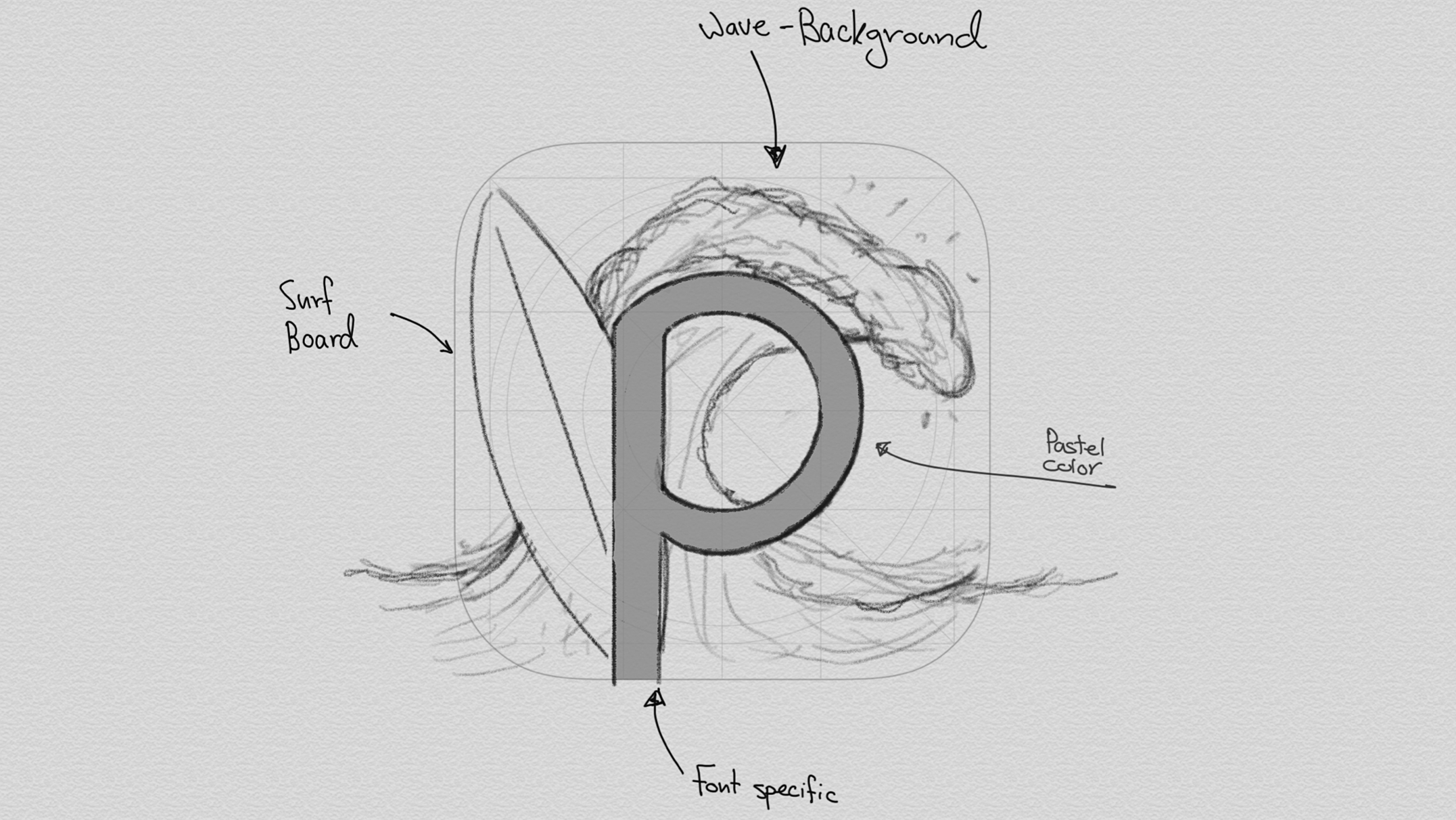
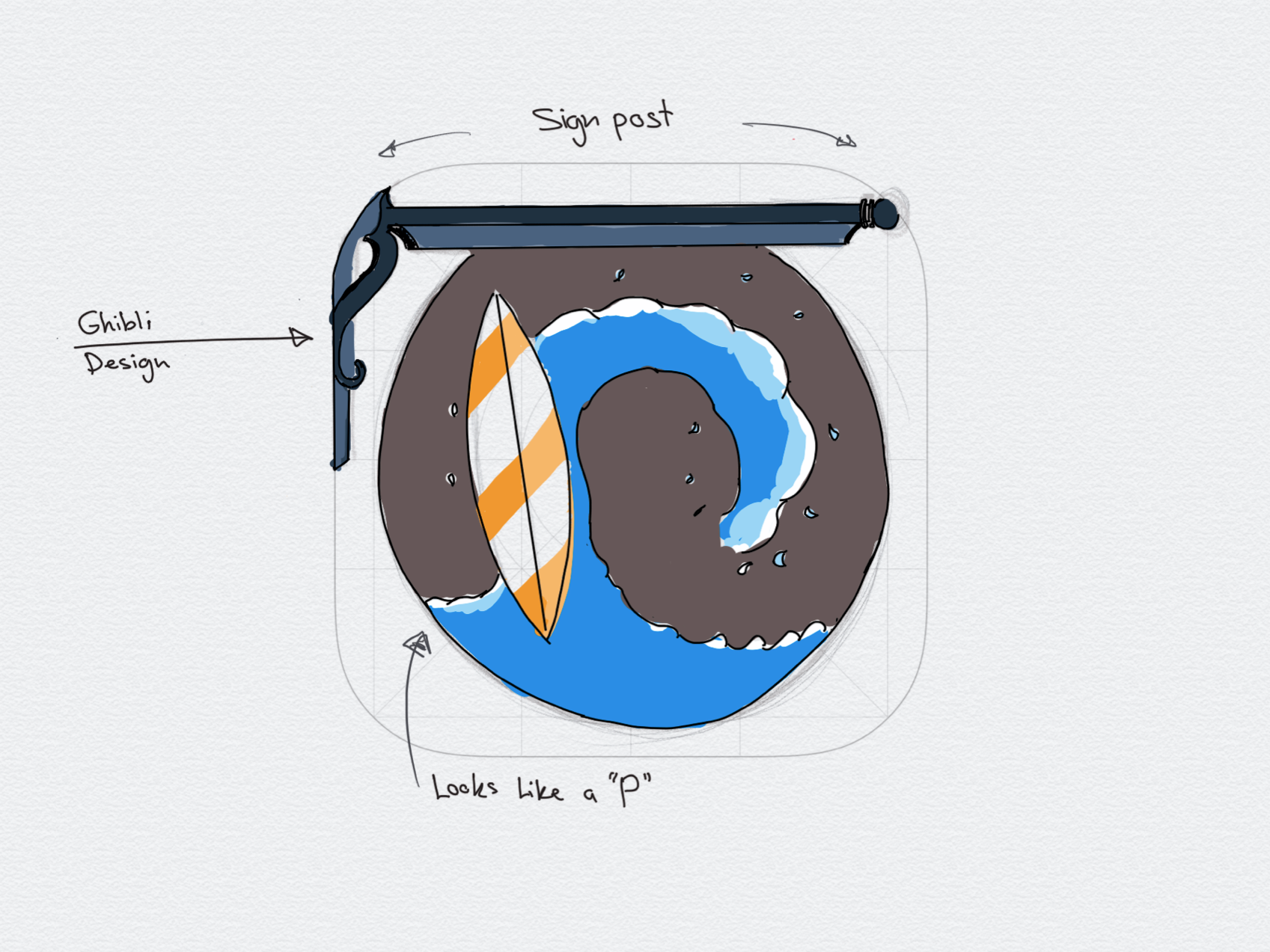
Talking about the logo in this post. I was not feeling the old one. I liked it but didn’t love it. I wanted a something standout, distinct and easy to recognize. I knew that I wanted the letter P in it however I didn’t give much thought on how to tackle it. So I was on the chase for about a month to look for inspirations. After long hours of sketching and studying, it clicked! Have a wave in the logo as the curve in the letter P. Very Simple. Right? No. It took me about a week to figure the font type. Another to figure out the design. I was all over the place and wasn't impressed with my progress. So I made a bold move and threw all that I had worked on for the past two weeks and start fresh. First, I had to make a set of criteria that I need to focus on. My guidelines were to have a simplistic and unique logo. Second, is to make it recognizable and needs to be pixel-dense and scalable from a small smartphone screen to a desktop monitor. And lastly, is to make the logo compatible in light and dark modes.
Simple
Original
Easily recognizable
Scalable
High resolution
Light/Dark mode ready
So I have used the iOS app logo template for geometric references. After a few design drafts, it started to come together but not quite there. Then one night I was watching one of my favorite Japanese tv shows. They were talking about types of sea waves which was very peculiar. In one of the segments was the famous painting, The Great Waves off Kanagawa (かながわおきなみうら). It is one of my absolute beloved paintings. I can’t describe what draws me to it. Maybe the different shades of blue or the thick bold outlines or how the waves look like tiger claws. The issue is how to put that in my logo? With the help of Procreate and Illustrator apps, and a few trial and error, I saw it! A surfboard and a wave that resembles the curvature of the letter P standing in front of the sun.
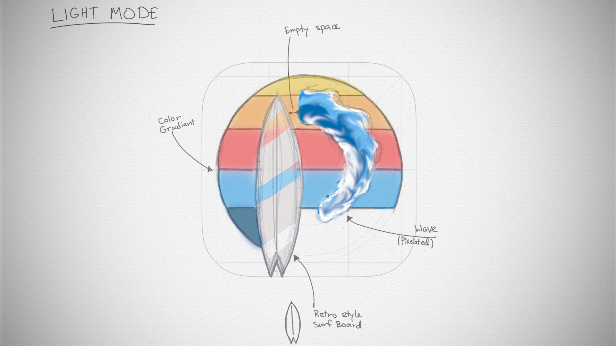
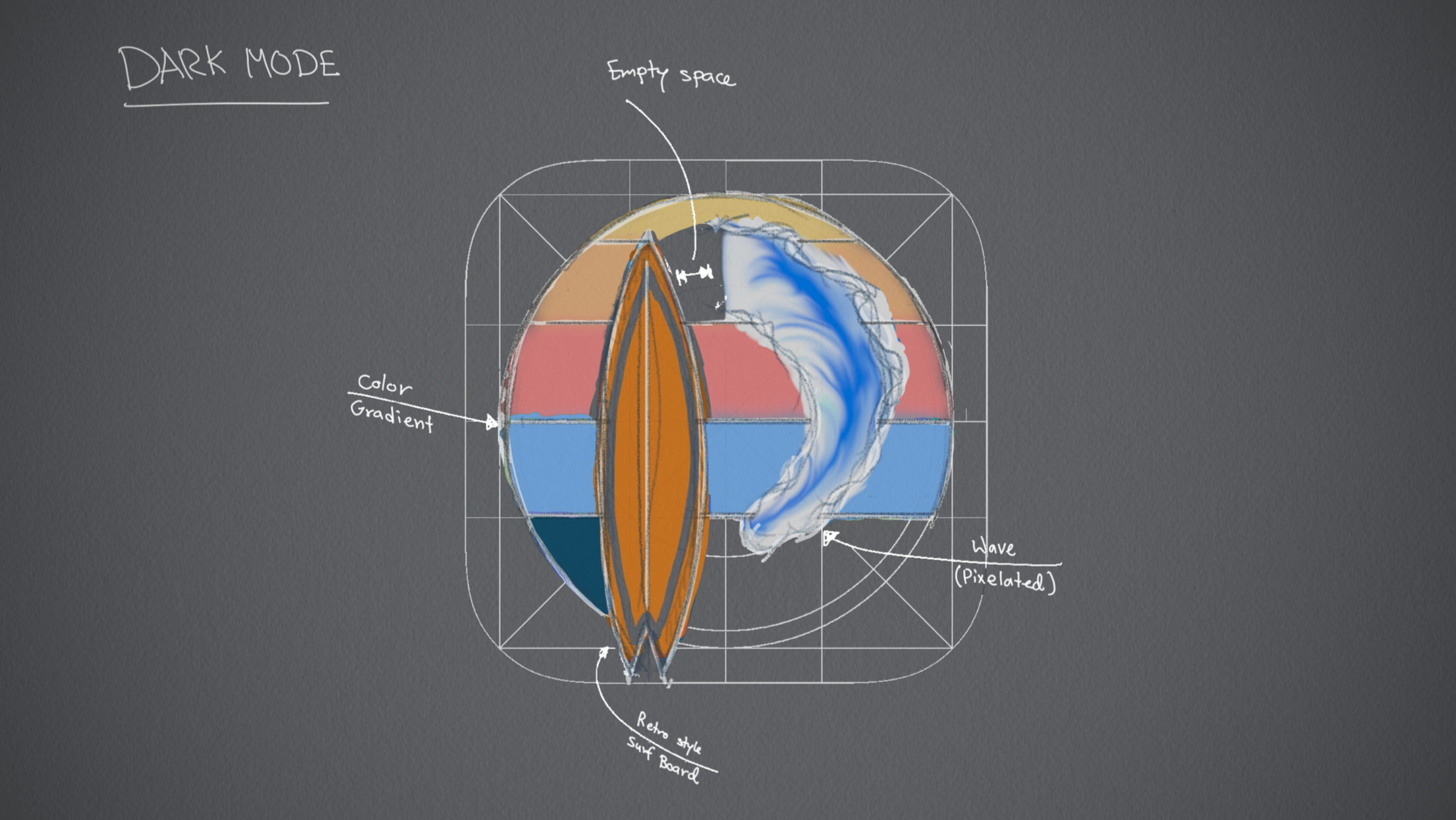
I thought it was over now though I was sadly mistaken. It needs the perfect colors to come to life. I have posted about colors before and what kind of shades I appreciate looking at. I went back to research in-depth about how colors interact with each other. Finding out how different shades have interesting complementary counterparts. That was an insightful learning experience. then I start testing combinations of colors in light and dark backgrounds. Finally, it all came together.
As a disclaimer, I'm not a professional graphic designer still I'm so proud of my effort. When I see the logo for Pixelwaves, I see myself.
